So you are trying to identify the price or cost from a table containing values for specific date ranges. Luckily you are considering using DAX to do this.
An example of this might be interest rates, stock prices or inventory cost, where values change periodically. If you have many different sku's (stock-keeping units) where prices change frequently, across many different stores or locations, you can generate a large lookup table fairly quickly - airline prices are a prime example of this.
In today's example we will consider the purchase (or sale) of a select group of items (Sales table), for which we want to look up historic pricing data that is specific to each of 442 products, sold in 9 countries by 16 suppliers, in 5 currencies.
We have a price for each sku/country/supplier/currency combination, along with a date range for which each price is valid. If the price is still valid however, the "To Date" field is left blank:
Price values by date range

The price for each item has changed over the course of time, and we want to know, out of this lookup table containing 8,461 rows of prices, what is the total amount that our quantity of items has cost us.
While the analysis is simple enough to do in vanilla Excel with limited data, it can become very burdensome when you throw in a few more price specifics, like we have done here.
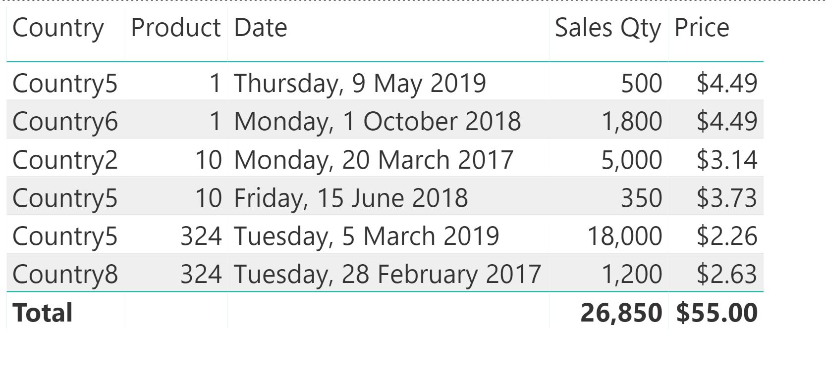
Sales table
Let's consider the Sales table for a moment:

For each product, this table shows the date on which it was bought, along with the quantity, the supplier and the country for which it is destined.
The values for Country, Product and Date all come from dimension, or lookup tables, where the data model connects data tables to lookup tables using relationships:

Something interesting happened when I connected the sales date field to the date field in the calendar. Note how it created a 1-to-1 relationship instead of a 1-to-many relationship by default. It's because in this example, there happen to be no duplicate date values in either the Sales table, or the Calendar table. In a real world scenario though, that would be the exception rather than the norm. So, we would need to modify the relationship to the Calendar table to be 1-to-many:
Power BI Data model

So how do we now look up the price we paid for each of those lines, from the Price table?
We know that the price will correspond to the date range where the transaction date falls within. Put another way, the "From Date" of the price will be earlier than the transaction date, and the "To Date" will be greater than the transaction date.
What does that mean for our constructing our price formula? For each line in our sales table, we wish to filter the price table, keeping only the rows where the sales transaction date is greater than or equal to the "From Date" of the price, but also less than the "To Date" of the price. But remember the blank "To Date" values where the prices are still valid? We can add that as an alternative to the price being less than the "To Date", where we don't have an end date value.
Luckily this is easy to write in DAX:
Price =CALCULATE (
MAX ( Prices[Amount] ),
FILTER (
Prices,
Prices[From Date] <= MAX ( Sales1[Date] )
&& (
Prices[To Date] >= MAX ( Sales1[Date] )
|| Prices[To Date] = BLANK ()
)
)
)
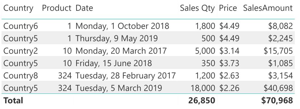
Let's add our Price measure to the matrix visual:
Sales table with Price DAX measure
Looking at the price values for each row, we can verify that they do in fact correspond to the appropriate ranges, for each of the products and countries (you have to use lookup tables for those because you're looking at information from two data tables on the same matrix visual or pivot table). The Total row is derived with Filter Context. Thinking about how the Price measure is constructed, what would be the Maximum value (aggregator used) of the price for all products with a blank end date? Looking at the data view of our price table, with prices in descending order we can see it's 55.

Now that doesn't make sense in the context of what we are trying to convey for pricing, so we need to exclude that value from the pivot table. We can do that using the IF(HASONEVALUE()) pattern to only calculate a price for lines that have a sales date:
Price =IF (
HASONEVALUE ( Sales1[Date] ),
CALCULATE (
MAX ( Prices[Amount] ),
FILTER (
Prices,
Prices[From Date] <= MAX ( Sales1[Date] )
&& (
Prices[To Date] >= MAX ( Sales1[Date] )
|| Prices[To Date] = BLANK ()
)
)
)
)
The only part that's missing now is the Sales Amount measure, where we multiply the sales qty with the appropriate price. This can be done using the SUMX function to iterate over the sales table and calculate the appropriate total:
SalesAmount =SUMX ( Sales1, Sales1[Qty] * [Price] )
Sales table with Price and SalesAmount DAX measures
I recently came across an interesting use case for the Groupby function in DAX, and while doing so, thought it would also make a great example for explaining evaluation context in DAX.
Consider the following table of data showing purchase requirements for two products, from multiple suppliers.
Each product/SKU combination can only be bought in a certain minimum order quantity, so even if you need to purchase only 3 units of product A in an XS stock keeping unit (SKU), you need to buy at least 100 to comply with the rule.
| Date | Supplier | Product | SKU | Min unit qty | Qty Required |
| 31/05/2018 | Supplier2 | A | XXS | 100 | 14 |
| 31/05/2018 | Supplier2 | A | XXS | 100 | 20 |
| 31/05/2018 | Supplier1 | A | XS | 100 | 14 |
| 30/06/2018 | Supplier1 | A | XS | 100 | 3 |
| 30/06/2018 | Supplier2 | A | S | 100 | 64 |
| 30/06/2018 | Supplier2 | A | M | 80 | 4 |
| 30/06/2018 | Supplier1 | B | XXS | 100 | 91 |
| 30/06/2018 | Supplier1 | B | M | 80 | 9 |
| 30/06/2018 | Supplier1 | B | L | 80 | 23 |
| 30/06/2018 | Supplier2 | B | L | 80 | 18 |
| 30/06/2018 | Supplier1 | B | XL | 60 | 18 |
| 30/06/2018 | Supplier1 | B | XL | 60 | 18 |
| 30/06/2018 | Supplier1 | B | XXL | 60 | 7 |
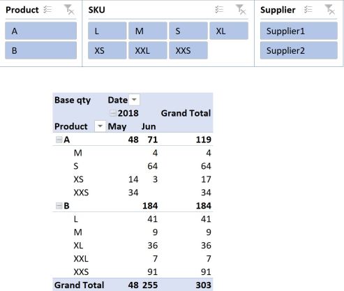
With a bit of manipulation, you could present the data in the following pivot table, using a measure (Base qty) to aggregate the quantity required with a simple sum:
Next, you might want to work out an order plan that complies with your minimum order requirements. In its basic form (I’ll use the DAX Variable syntax), this equation would look something like this, where [Minimum Unit Qty] = MIN(Table1[Min unit qty]) ♦:
Qty in unit packs 1 =
VAR frac =
    DIVIDE ( [Base qty], [Minimum Unit Qty] )
VAR Unitqty =
    ROUNDUP ( frac, 0 )
RETURN
    Unitqty * [Minimum Unit Qty]
♦ You could have used the MAX or the SUM function here too.
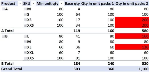
Adding this measure to the pivot table and removing date information so we just look at the total amount for all time, yields the following result:
If it isn’t immediately obvious, the totals of our new measure don’t add up to what we might have hoped for. This is because our new measure is evaluated in FILTER context.
What does that mean?
While there is no single minimum unit quantity for product A across all SKU’s, (there are multiple), our measure for aggregating the minimum order quantity tells it to look for the MINIMUM value across all Product A’s in the current filter context. In the example above, for Product A, that is 80 units when we consider the total quantity for Product A.
While we know of course that this is not at all relevant to the total quantity across all Product A’s, it does explain the result the formula is giving us. 119 units divided by 80, rounded up to zero and multiplied by 80 gives 160, so that is how the totals are calculated. In the same way, you can confirm how the numbers 240 and even the 360 were arrived at. That is filter context in action.
Coming back to my previous comment where I said you could have also used the MAX function to aggregate the minimum order quantity, the result would just have used the value 100 instead of 80 or 60, in the cases of Product A or B, but your totals would have been calculated in a similar manner.
The SUM function would operate in the same way, except it would use the sum of the minimum order quantities as the denominator and give us a total of 360, which is what we want, but this is purely a coincidence, because the result would have still been calculated using filter context, and if the data were a little different, or even if we just had more rows of data, you would quickly find that the totals don’t “add up”.
Okay, so we know we don’t want filter context when looking at totals, but how can we change FILTER context into ROW context?
The first thing that popped into my head was SUMX, because I know that this function forces filter context into row context, and I often use it to make the totals in pivot tables “add up” to what I want to see, and to what makes sense to me.
Let’s modify our equation to use SUMX then (we’ll ditch the Variable syntax for now because we have to refer to “naked columns” for this SUMX to work):
Qty in unit packs 2 =
SUMX (
Table1,
    ROUNDUP ( Table1[Qty Required] / Table1[Min unit qty], 0 )
* Table1[Min unit qty]
)
Adding this measure to our pivot table yields some more confusing results:
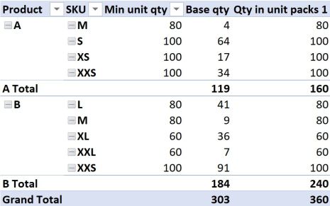
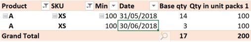
The results in the first couple of lines look fine, however the third and fourth lines might give you reason to frown. We only need 17 units (line 3), and the minimum order quantity is 100, yet the formula returns a value of 200? How can that be? All we did was apply a SUMX to the value our measure returns. At least the totals appear to be adding things up as we expected.
The reason for the measure returning 200 in the third line instead of 100 has to do with the fact that the 17 units in our underlying data is made up from two different dates; 14 units in May and 3 units in June (see the very first pivot table). These dates are not shown in our current pivot table, but they still exist in the underlying data source. Our new SUMX formula honours this “hidden” row context, as can be revealed by adding the Date field to the pivot table filtered to show product A and the XS SKU:
The formula therefore does the calculation on both instances, or both ROWS in our underlying data.
What about the fourth line then? The quantity is only valid for one date, and comes from the same supplier too, so why does this result give 200?

To get the answer in THIS case, we have to dig a little deeper. Looking at the source data table, we can see that the 34 units in May are comprised of two different lines, or rows, for 14 and 20 units respectively. Once again, SUMX has performed our calculation on both rows of this data individually before adding the result together, because we have forced context transition to ROW context. The results for Product B can be explained in a similar way, noting that for the SKU = “L”, the product is sourced from two different suppliers, so technically 160 is correct and 80 is wrong! Product B SKU “XL” is made up of two duplicate rows again, like Product A SKU “XXS”.
The GOOD news is that we have confirmed that yes, SUMX changes FILTER context into ROW context, because it now evaluates the formula for each and every row in our source table, and the totals at least “add up” as we would expect. The BAD news is that SUMX is now giving us “wrong” values for some lines.
Okay, you might say, well why don’t you just go back to Power Query or SQL and group the data to get rid of duplicate rows and the date information, and use this as your new source data?
This would work, but we would then lose the ability to apply a date filter to our data after we load it to the data model.
What if we could group the data “on the fly”, doing the grouping only on the selected subset of data as filtered by slicers and other filters?
Enter GROUPBY
The GROUPBY function in DAX can be used to calculate a new table “on the fly”, where we group our underlying data source to only include the columns we specify, while honouring existing external filters.
We can then use SUMX, AVERAGEX, MAXX or any other such iterator to aggregate the numbers in the current group (table) that we are calculating on the fly. To refer to this virtual table, the syntax CURRENTGROUP() is used.
So what does that look like in our example? I want to group this data to exclude date information. We’ll use the DAX Variable syntax again:
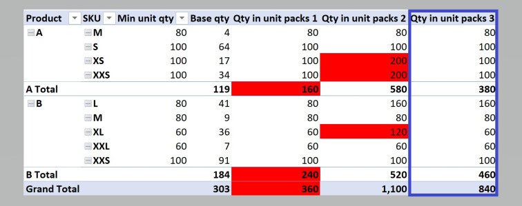
Qty in unit packs 3 =
VAR Groupedtable =
    GROUPBY (
Table1,
Table1[Supplier],
Table1[Product],
Table1[SKU],
Table1[Min unit qty],
        "Groupedvalue", SUMX ( CURRENTGROUP (), Table1[Qty Required] )
    )
VAR something =
    SUMX (
        Groupedtable,
        ROUNDUP ( DIVIDE ( [Groupedvalue], Table1[Min unit qty] ), 0 )
* Table1[Min unit qty]
    )
RETURN
    something
♣ You don’t have to group data using columns from the same table; you can use columns in lookup tables, but the first table in the GROUPBY function would be the table containing the numeric data you want to group.
While verbose, the result gives us exactly what we need:
Could I have used the SUMMARIZE function?
Absolutely, but this is not a post about SUMMARIZE. We can use a very similar syntax, with the exception of the CURRENTGROUP() reference:
Qty in unit packs 4 =
VAR Summarizedtable =
SUMMARIZE (
Table1,
Table1[Supplier],
Table1[Product],
Table1[SKU],
Table1[Min unit qty],
"Summarizedvalue", SUMX ( Table1, Table1[Qty Required] )
)
VAR something =
SUMX (
Summarizedtable,
ROUNDUP ( DIVIDE ( [Summarizedvalue], Table1[Min unit qty] ), 0 )
* Table1[Min unit qty]
)
RETURN
something
So how are they different?
Summarize does an implicit CALCULATE to each extension column it adds, whereas GROUPBY does not. GROUPBY is also tipped to be very performant, and personally I found the syntax more palatable than traditional explanations of SUMMARIZE and its variations. But neither of those considerations are important for our current dataset.
The really great thing about using GROUPBY or SUMMARIZE to recalculate the grouped table “on the fly”, is that you can still apply an external filter to the data (such as a date filter, or a transaction ID filter, if we had that detail in our data set) even if it isn’t included in the calculated group, and it will respond appropriately. That is really what enthused me to write this post.
I’m sure there are other implications to consider for choosing between GROUPBY and SUMMARIZE – let me know in the comments – but hopefully you’ve learned something.
Seasonality is an important phenomenon to consider for many businesses, and in the context of this post refers not only to seasons in terms of Winter, Summer, and so on, but will also consider how you can report on business activity in terms of custom-defined seasons.
To state the obvious, an ice cream shop might sell less ice cream during winter than it sells during summer. Clothing, cycling gear and even chocolate are also products that have seasonal elements in their trade. There are countless more examples, but the point is that you can plan your sourcing and/or manufacturing activity in accordance with seasonal demand. Doing so might have some significant financial and logistical implications too – why would you want to have the previous season’s stock, taking up room (and tying up money) in a shop or warehouse where you need space for the current season’s product? Does the product have a short shelf life, or is it sensitive to temperature fluctuations from one season to the next, in which case you really only want to buy enough stock or raw materials for the relevant season.
You may even decide that you want the amount of safety stock you hold to depend on the season, or schedule promotions by season.
DEFINING THE SEASONS
Central to your ability to analyse your data on a seasonal basis, is the definition of the seasons you choose to adopt. For instance, do you have only two seasons (busy and not busy), three, four or sixteen seasons? This step is the most important to nut out before continuing.
Let’s use an example where we have four seasons, as defined for Australia in general:
Summer: December to February
Autumn: March to May
Winter: June to August
Spring: September to November
Next is to bring those seasons into your calendar table. Depending on whether you used Get & Transform (Power Query) or Power Pivot to construct your Calendar table, the syntax used for doing this would vary accordingly.
Let’s assume you constructed one using the Calendar construction method described here, starting at 2015.
A Switch(True(),…) calculated column can be used to identify the season of interest:
Season =
SWITCH (
    TRUE (),
'Calendar'[Month Number] = 12
|| 'Calendar'[Month Number] <= 2, "Summer",
'Calendar'[Month Number] <= 5, "Autumn",
'Calendar'[Month Number] <= 8, "Winter",
    "Spring"
)
ADD A SEASON INDEX
Next we want to add a counter, or index to the Season, but if we just count the seasons as defined above, we’ll only get a maximum of 4. Perhaps we can combine the Season with the Year value, and therefore get a unique season for each year? Not a bad guess, but there’s a complicating factor here.
The problem with how our seasons are defined, is that the same Summer always spans across two different Year values:

If we simply combined Season with Year to obtain our unique index for each season as follows:
SeasonYear = 'Calendar'[Season] &" "&'Calendar'[Year]
we would get the same index value for Summer 1 (Jan & Feb) and Summer 2 the following December, which falls in the same year. Our index values would effectively mix Summer 1 with Summer 2, Summer 2 with Summer 3, and so on. Not good.
How then, do we get the appropriate index number?
My preferred way is to consider again the definition of the seasons, as well as the starting year of the calendar. The first year in my calendar is 2015, so by varying the number I subtract from the year value depending on the month number, I can ensure that Summer 2 in Dec 2015 yields the value “Summer 2” and Summer 1 in 2015 yields the value “Summer 1” with the following formula:
SeasonNumber =
'Calendar'[Season] & " "
    & SWITCH (
        TRUE (),
        'Calendar'[Month Number] >= 12,
        'Calendar'[Year] - 2013,
        'Calendar'[Year] - 2014
    )
So when I consider year 2015, I subtract one less year from 2015 in December, making the index value one larger than that for any other in 2015.
The numeric counter, or season index is then calculated, referring to the SeasonNumber column as the value we wish to count:
SeasonIndex =
CALCULATE (
    DISTINCTCOUNT ( 'Calendar'[SeasonNumber] ),
    FILTER ( 'Calendar', [Date] <= EARLIER ( 'Calendar'[Date] ) )
)
The SeasonIndex value provides you with a unique numeric value for each chronological Season in your calendar.
“Why do I need a Season index?”, you may ask. Well, having a numeric index for the season allows us to do some clever stuff in analysing sales (or budgets), such as calculating the average product sales for a particular season in a particular year. Calculating just the average for a particular year, or the average for one of our four seasons (by implication all years), would give us quite a different result.
Your calendar should look something like this now (I deleted day of week detail and hid the columns I don’t want to be available in my Pivot table fields):

Remember to sort the Month column by the Month Number and the FinMonth column by the FinMthNum, otherwise your graphs and pivot tables will sort months alphabetically.
EVALUATE BY SEASON
Let’s imagine you have a table of product quantity per month, for a period spanning a few years. The quantity can be a mixture of sales and budget figures, depending on timing:
 …
…
I imported the numbers in the table to Power Pivot using Get&Transform (Power Query), where I converted the Yearmonth values to a date field. This allows me to create a relationship to my Calendar using the Date column. After that I can report on the sales by season, as it is already in my Calendar:
AVERAGE QTY PER SEASON
Say for instance I wanted to know what the average sales per season was, superimposed on my existing pivot chart. Hint: Adding a measure that is just the Average( ) of the sales qty to the chart won’t look any different to our existing ProductQty measure using Sum( ) as aggregator, because the evaluation context that the pivot table provides is too granular to see the effect of average aggregation. The desired measure needs to delve a little deeper. Enter AVERAGEX:
SeasonAvgProdQty =
AVERAGEX (
    FILTER (
        ALL ( 'Calendar' ),
        'Calendar'[Seasonindex] = MAX ( 'Calendar'[Seasonindex] )
    ),
    [ProductQty]
)
Adding this to the pivot chart (with some formatting to highlight the average values and diminish the monthly values) results in the following:

See how useful that Season index has become? The same measure can be added to a pivot table, of course, if you wanted to see the actual values.
So what else could you use the seasonal average value for? Well, how about that safety stock buffer we talked about earlier? You might have a view that you always want to maintain a safety stock buffer of ten percent above the average seasonal budget.
SAFETY STOCK LINKED TO SEASONAL AVERAGES
You can probably already guess how this measure will look:
SafetyStock=
1.1* [SeasonAvgProdQty]

Predictably, it will just always be 10% higher than the seasonal average value.
Depending on your data, you might decide that working with four seasons provides too much granularity. In the example above, I would be tempted to combine autumn with winter, and spring with summer, resulting in a Warm and a Cold, or perhaps a Dry and Wet season. This would require a redefinition of the previous seasonal split:
Season =
SWITCH (
    TRUE (),
    'Calendar'[Month Number] >= 9
        || 'Calendar'[Month Number] <= 2, "Warm",
    "Cold"
)
We would also need to amend the SeasonNumber definition, as the season change where we span across two distinct Year values now starts in month 9 instead of month 12:
SeasonNumber =
'Calendar'[Season] & " "
    & SWITCH (
        TRUE (),
        'Calendar'[Month Number] >= 9,
        'Calendar'[Year] - 2013,
        'Calendar'[Year] - 2014
    )
This results in the following average spread:

Hopefully you’ve learned something, let me know in the comments if you found it useful, and feel free to share with your fellow Power Pivot fans.
Many people who do not regard themselves as Excel gurus find themselves in situations where they would like to be able to represent tabular data somehow to allow them the functionality of filtering, cross-tabulation (pivoting) and hierarchical sorting that pivot tables offer.
The Excel wizard for creating pivot tables could certainly have been more instructive, but that doesn’t mean creating a pivot table has to be hard.
An important concept to understand for creating pivot tables is the difference between data in a pivoted layout versus data in an unpivoted layout. Data in a pivoted layout is what you would commonly encounter in tabulated form in books, web sites, scientific journals, or even the calendar displayed on your computer or smartphone. It is optimised for human consumption and understanding, and a typical feature of it is that one or more categories are represented as rows, while another category (very often related to some reference to time) is represented in the column headings, with the numeric or categorical data presented in the body of the table. The following table is an example of fictitious data in a pivoted layout (not necessarily an actual pivot table):

Without knowing about pivoted vs. unpivoted layouts, people tend to create pivot tables using data in a pivoted layout as source for their pivot tables:
The problem with this approach is that it is actually not possible to swap rows with columns, and if you had hundreds of columns in the source data, it would take you nearly forever to include all the data in the pivot table. Not good. By the way, if the default aggregation that the pivot table performs is Count instead of Sum, it is an indication that you have text or error values in your source data somewhere.
There is some good news though. The same data can be presented in unpivoted form by condensing the table to contain as few columns as is absolutely necessary, while not being concerned with the number of rows. Let’s look at the first table. Unpivoting can be achieved by identifying that the columns all represent one category of data, which in this case is time. If we instead wish to represent that category as one column (MthYear), we can represent the steps conceptually as follows:
Step 1: The columns that represent the category to be transformed into one column (unpivoted) are identified in blue:

Step 2: A new column is created that will contain the old column headings as values:

Step 3: Another new column (Qty) is created that contains all the numeric data of the original table:

Step 4: The old, multiple columns disappear and are replaced by the two new columns, while the row category values are repeated for each new row created, to preserve the context of each numeric value:

All the original information is still there, the difference is just that in the unpivoted state, the table only has three columns, whereas before it had seven. It is usually harder for our brains to conceptualise the numbers than the same data in a pivoted state, but the reason for wanting to do this is because Excel actually prefers the unpivoted version as data source to the pivoted layout. Check out the video below for a demonstration of this:
With this source layout, it is very easy to swap rows with columns, and you only have three fields to include, irrespective of the time horizon your source data considers. Filtering on either rows or columns is also much easier.
There are some great videos online explaining how to unpivot data using Get&Transform, but I’ll add a video here showing how to do it for this particular case. For good measure I’ll also show a few useful data transformations and how to change the pivot table layout itself:
I hope you found this explanation useful. I certainly wish I knew about un-pivoting and how to optimise data sources for pivot tables much earlier than when I did find out, but it’s never too late to learn!
Many companies operate across financial years rather than calendar years, and still others operate across a 4-4-5 calendar or some variation thereof.
This post will talk about reporting numbers across financial years – that is, starting on the 1st of July and finishing on the 30th of June.
You may be familiar with some of DAX’s inbuilt time intelligence formulas, such as TOTALMTD, DATESYTD and so on, but alas, there aren’t similar ones available for FYTD (Financial Year to Date), or 4-5-5 calendars. Perhaps one day they will become available, but until then we have to rely on custom time intelligence formulas, or some manipulation of the inbuilt formulas.
The other significant drawback to inbuilt formulas is that your data has to have daily granularity. This may simply not be available, in which case you have to group data to coincide with the last day of the week or month, or quarter, etc. Or, if you have millions of rows of data and you don’t need to evaluate things at daily granularity, you may just have to suffer the resulting performance hit.
The good thing about using a custom time intelligence formula is that the structure of the formula is quite powerful and adaptable to a variety of different scenarios (whether you want to report on financial years, quarters, financial year quarters, weeks, arbitrarily defined seasons, or a combination of the aforementioned). Your data can also be at any granularity, and you get to develop a much deeper understanding of how the result is obtained, making it possible to tailor formulas to give you exactly what you’re after.
The basic structure of a custom time intelligence formula has been covered extensively by others, and I also like Matt’s explanation here. They can seem a bit daunting to write at first, but once you’ve done it a few times, the penny drops and it becomes quite easy. I strongly recommend you read their posts for a full understanding of how the formula works, but that’s not the aim of this post.
I’ll do a few examples at different levels of granularity to illustrate.
Assuming you have some data at daily granularity, you might have defined a measure aggregating your total sales:
Total Sales =
SUM ( Salestable[SalesQty] )
You would then have to create a Financial Year (text format) column and a Financial Year Index column (numeric format) in your Calendar, assuming it’s actually called “Calendar” (you can follow instructions on how to do that here), and once you have those, you can define the FYTD sales formula as follows:
Total Sales = SUM ( Salestable[SalesQty] )
Looking at the formula, you might realise why it is necessary to have a numeric index column for FinYear. Hint: It’s because of the MAX function, which only accepts numeric data. DAX doesn’t know that the text “2017/18” represents a greater value than “2016/17”, which is why the numeric Index value is needed.
But there is also an alternative option you could use if your data is at daily granularity, which doesn’t require the custom time intelligence formula or an index column. In fact, it relies on one of the built-in time intelligence aggregation functions, where you can specify the year end date as a text string:
Sales FYTD =
CALCULATE (
[Total Sales],
    FILTER (
        ALL ( ‘Calendar’ ),
‘Calendar'[FinYearIndex] = MAX ( ‘Calendar'[FinYearIndex] )
&& ‘Calendar'[Date] <= MAX ( ‘Calendar'[Date] )
    )
)
)
If you left out the optional “June 30” part of the formula, it would revert to the default, which is December 31. Of course you could type any end date here if you wish, and the formula should still work.
Now let’s consider data at monthly granularity. Say you have sales data aggregated by Yearmonth (format YYYYMM, but make sure it’s formatted as a number) . The structure of the formula is exactly the same:
Sales FYTD =
CALCULATE (
[Total Sales],
    DATESYTD ( ‘Calendar'[DATE], “June 30” ),
    ALL ( ‘Calendar’ )
)
If your aggregation time interval is specified as text, you may need to create a numeric index column for it first.
So there you have it, a few formulas for aggregating data across financial years, allowing for different levels of granularity.
Please share if you found the post useful, and feel free to leave a comment.